Everyone will see it. Every demographic.
- Lemon Demon, Redesign Your Logo
So. This site is our first attempt at really fully posting together; at carving out our identity as a system.
And so... we're not a fan of a lot of advice about personal brands, but getting some kind of cohesive identity for the blog was important.
We should also preface this by saying we are absolutely not designers, but this also feels like something we had to explore ourselves.
choices
We wanted something that represented both of us, while also kind of having some 80s/90s vibes. Originally, we were looking at something inpired by The Video Collection, but this didn't feel right.
League Spartan is ❤️'s "brand font", making it the easy choice.
Finding one for 💜 was harder, a lot of the fancier script fonts are kind of well, unreadable. Eventually we found Comforter while looking through Google Fonts.
iterations
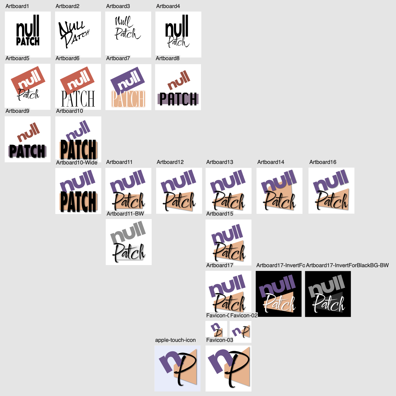
This was our first time using the Artboards feature in Affinity Designer, and it proved very useful for a visual journey of how we leaned into a concept.
It allowed us to quickly make lots of variations, eventually leaning in to the combination of bold text and parallel lines, incorporating some of our colours.
It even made it really easy to make the abridged version used for the favicon and Apple touch icon! And then export all the ones we wanted as one unit, without having to export layers individually as we might have had to do in the past.
Why not red and purple? Match the speech bubbles
While these colours do work well for showing us like this, there is a slight problem with the red and white look and where we happen to live.
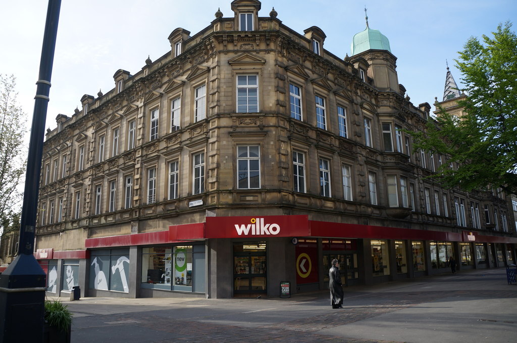
image of Wilko from here, licensed under CC-BY-SA-2.0.
Font might not be the same, but eh, close enough that I don't particularly want to provide a reminder of that recent national tragedy.