Or doodly thoughts, at least.
The year is approximately 2005. I am sitting in an uncomfortable chair in a rarely used classroom. The class is learning to learn, one of the "filler" topics to pad out the UK secondary school curriculum at the time - certainly filler in the sense of never having a consistent classrooms between sessions. The teacher has explained the different learning styles, I think there was a brainstorming session - and we've now moved onto mind maps, a topic that we've since learned was treated as something of a holy grail by some educators.
And something about our brain rejects this as a useful concept to us. On paper, too messy, too easy to fuck up line length. There aren't good digital applications available within education at the time (being 2005, there are no permanent school issued computers, unlike the later iPad and Chromebook eras) - but if there had been, we probably would have taken umbrage with the way things move around when trying to add things, just as we get annoyed with the problems of adding on paper.
Time passes.
The year is probably around 2006. Along with possibly still checking on my NeoPets [1] and the Homestar Runner Wiki among other sites, one of the web sites I like to visit is Webpages That Suck [2], a takedown of various web design crimes of the era. One of the things the creator takes umbrage with is the idea of Mystery Meat Navigation - websites that only use random icons for navigation with no other indication of where they go. We start noticing it more often when it happens. [3]
Time passes.
The year is definitively 2007, going by an email receipt. We are one of the only UK owners of a 1st generation Microsoft Zune. While one of the things we're glad for is to be free of the tyranny of iTunes [4], we do end up really appreciating the way typography is weaved throughout the interface; with the combination of strong backgrounds and seemingly infinite potential for horizontal scrolling on a small screen. This admiration for what (briefly) comes to be known as the Metro Design Language later causes us to purchase a Windows Phone, as well as mount a tepid defence of some parts of Windows 8. [5]
A lot of time passes.
It is now November 2025. We have a large volume of notes built up in Obsidian, but we have ended up stalling on a lot of things. With the end of the year soon approaching, we start thinking about the process of moving some things physical again as a way of maintaining focus, since we mentioned doing so in September. This prompts a small investigation of what options for planners are available, including a small rabbit hole of looking up videos of people flicking through their journals for the year. Some are beautifully illustrated by clearly professional designers; some are much looser. The term "sketchnotes" keeps being mentioned (including on some podcasts we listen to) and piques our interest, as a way of moving past perfectionism. We decide to see what we could gain by drawing things out more, and order a couple of books.
and here we are
And so this brings us to the present day. Our skills at drawing are still questionable. When we do lay our thoughts out in terms of visuals rather than words and mental images, it's usually in the context of solving a specific problem - diagramming something out at work to understand which component is failing, getting outfit references together, that kind of thing - or as the mentalist Derren Brown suggests in Tricks of the Mind, converting arbitrary numbers to words to help create stronger mental images and aid memory - such as converting 1743 to "le tram", conjuring up the image of public transportation that's as French as it can be.
And it's in that context that we read through The Sketchnote Handbook by Mike Rohde and Sketch Your Mind by Zsolt Viczian, wanting to understand both more how we could integrate more visuals, and if we would even want to.
⚠️
warning
Before we go further, there is a problem with Sketch Your Mind that means we cannot recommend it.
The author wrote and self-published it in 6 weeks as an experiment, with heavy AI assistance due to English being their second language. (How much you choose to believe that as a statement is up to you - but they have been speaking about their ideas from before the current crop of large language models, for however much that counts - but they are also still actively using LLMs for other knowledge work).
Anyway, as it is wont to do, AI flattens the voice. It is impossible to say what the raw, unfiltered version of it would have looked like. There are mistakes here that would not have survived any contact with a sophont editor - such as six different 'WHY IT MATTERS' headers in the space of a few pages. Additionally, given some similarities in tone, I have a suspicion that it was the same model responsible for The Smartest Baby of 1996.
There is an amount of overlap, but the two have different things they're trying to do.
the sketchnote handbook
The Sketchnote Handbook is primarily designed for getting you sketching quickly to effectively take notes at live talks; getting the big ideas down in a notebook, and eventually, everything onto one shareable, Instagram-worthy page.
It does this with a strong focus on technique; an acknowledgement that simple, symbolic drawings are just fine for this purpose - even with seeing the lavish, sometimes confusingly laid out notes of professional artists. The basics of construction - and of just how much can be done with incredibly simple elements - of embellishing fonts, cross hatching. Of the tools you need to work with paper, of building up a library of visual elements that you know will draw your eye.
There are a couple of reasons this doesn't fully work for us, though the focus on simplicity is appreciated.
Even with simple icons, the act of drawing things out does take a bit longer when we're reading most books, when our brain is already in a mode to process words. And the resulting page isn't connected to the our whole connected notes system without transcription - and if we're transcribing anyway, we may as well often do that from plaintext with the important diagrams represented.
It does also come in bundles with a video course, and the video did work better for us taking visual notes at the same time as watching that, for what it's worth - one of those things where we can compare our notes on the talk given against the sample and see how our thought processes differ from the authors in terms of what's worth capturing.
sketch your mind
Sketch Your Mind takes a bit of a different approach - specifically, that visual notes can be just as well linked as text in a PKM or Zettelkasten system, if not more so - with multiple different visual models provided.
This is primarily handled through the Obsidian Excalidraw plugin, which the author is also one of the primary developers of. This allows for building up an icon or clip-art library and using them in multiple illustrations or seeing every instance in which they have been linked - for example, the humble D20 might appear in notes related to luck and fate, nerd culture in general, Dungeons & Dragons in the specific, the difficulty of seducing dragons, randomization, Blender mesh primitives (icospheres), etc. By combining simpler elements into larger illustrations, the point is made that links can be found which would be unlikely to be stumbled on by other methods, which is probably true - and is in contrast to The Sketchnote Handbook's approach in terms of the visual library more being about focusing on part of the page.
The ultimate thesis is to start each note with the visuals first and then to "flip the card" over to the other side for any additional text or links needed as supporting details - along with a heavy use of embedding full documents into larger pages.
However, this also presents the problem immediately - most of the workflows presented cannot work in any other tool, at least not without extreme inconvenience. Physical index cards are the most applicable - they can have visuals on the front, they can be flipped over to have text and links on the back - but it lacks any form of automatic method of linking symbol reuse back, so unless you're keeping track of every time you've drawn the same lamp post in larger pieces, it's difficult to link them back to the place you started.
Obsidian Excalidraw drawings are stored (by default) as compressed, non-sophont readable JSON embedded within a Markdown file, with text stored separately. This does mean that the words are safe if something should happen to the plugin, Obsidian itself, or Excalidraw as an open source project. But trying to extract the visuals at that point feels like it would be a problem.
Part of the reason why we've settled on Obsidian is the portability and durability of the majority of notes - plaintext, as a format, will long outlast us (and yes, we recognize the irony of linking to a YouTube video talking about the durability of plaintext). If Obsidian did stop working on every machine suddenly, we could make the switch to Neovim or whatever else takes our fancy for working with a folder full of Markdown files - we'd miss some app specific features like Obsidian Bases, but with those, I feel like we could much easier extract the same information with a shell script if we had to, rather than trying to re-generate visuals from JSON.
focus testing
One concept shared between both books is that of shareability; that you might wish to share the raw note to help everyone else along. Sketch Your Mind specifically suggests the idea of focus testing visuals on as many as possible for clarity and understanding.
As we've said before, our notes are ours. They're fuel for what is eventually output - be that an article like this, something at work, something in Blender or Unity - but they are not the output itself. Because we use Obsidian for journalling as well as for purely atomic notes, everything is intertwined in ways that would be wrong to share ("friend reminded me of this thing on date"). Many notes will have asides that might be meaningless to others that help us create better mental images - occasional references to layers being "like an ogre", a Simpsons quote that still lives rent free in our head despite not having watched the series in years, commissioned art we've got from artists, some obscure piece of video game trivia that is reliant on the reader having spent far too much time on sites such as The Cutting Room Floor.
And all of this is a perfectly cromulent thing to do with an audience of just us, because it's what strengthens our own connections. Everyone has these. If I mention the phrase "correct horse battery staple", there is a decent chance that if you've been on the internet long enough you're now thinking about secure passwords (and if you didn't think about secure passwords, congratulations on being one of today's 10,000). You can't and shouldn't focus test those out from the note stage, even if they don't make it to the final product - they might make sense if you're trying to sell something or to make a career out of educating in this way, but we're not; we're interested in better ways of working with our own knowledge.
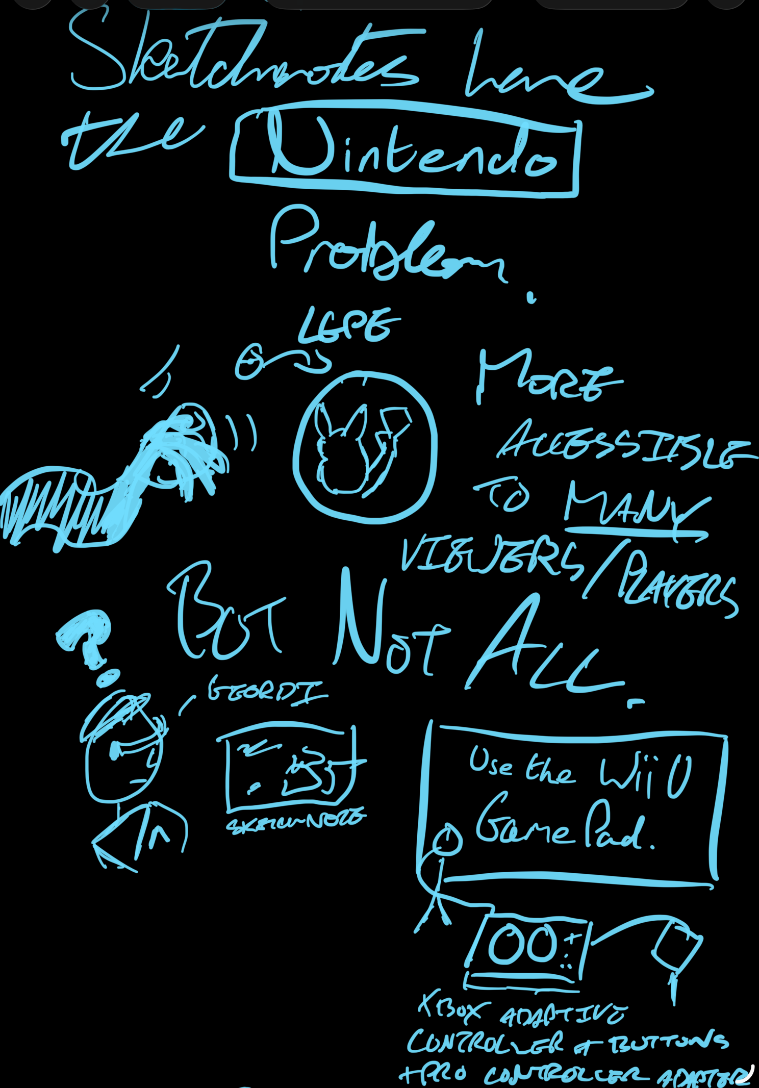
And of course, with sharing the raw note, comes a thing I like to call the Nintendo problem. A well presented sketchnote could be more accessible to many people than a big block of text. However - in the same way Pokémon Let's Go Pikachu and Let's Go Eevee were more friendly to many players but completely inaccessible to those that couldn't use the motion based controls or the alternate handheld control scheme - how do you write alt text that fully captures how the sketches connect?
so, what did we learn
In the end, we've kind of ended up back in mostly the same place, but at least a little more willing to go outside the same flow of linear text, even if it can be a pain to translate back if not just taking a photo/screenshot. [6] Our process of taking literature notes for the past few years has generally to do a handwritten pass (whether in a notebook or on the iPad) and then type up those notes, so a bit of added visual flair during the handwriting step can help solidify images for later - and the visual can be faster for live talks or videos that we're not constantly pausing our way through. They're never going to be Instagram worthy, we're never going to do a notebook flipthrough, but little bits, here and there.
What we have now that we did not have in the 2000s was perspective and a system that does - at least for the moment - seem to work for us, and going through this exercise has been good for making us appreciate aspects of that more. Other techniques were discussed in that learning to learn class, it's just mind maps stuck out as one method absolutely not aligned with our brain. I'm sure the idea of spaced repetition through the use of revision cards was brought up, but certainly not the idea of making cards the whole system - How to Take Smart Notes was only published in 2017.
As such, a lot of our notes from back then did end up as monoliths, now trapped in exercise books that may or may not be in the loft, never typed up, and forgotten to us now beyond suddenly being reminded about a physics concept from a Technology Connections video. Like a lot of things relating to our secondary education, it's nice to think about what could have been.
In the same way as a lot of things, learning about the way you learn is a matter of taking the things that work for you and filtering out what doesn't. We know the entirely visual approach is right for some, just not us.
footnotes
We lost the password at some point, and the associated email account was also long gone. ↩︎
This is an interesting example of the entropy of the Internet in action - the home page is still online despite not being updated since 2015, but a lot of articles and the majority of images are broken. ↩︎
It's nice that we get a reminder of this concept every single time we open the Windows 11 Task Manager because it basically never starts with labels shown. ↩︎
It is safe to say that our opinion of Apple has changed a little since then. ↩︎
There is, however, no defending the non-R2 version of Windows Server 2012; relying on hot corners on a desktop that can take advantage of Fitts's Law is one thing even if initially confusing, relying on hot corners in a windowed Remote Desktop session is quite another. ↩︎
Mermaid is simultaneously useful but also a pain if you have an idea how you want the diagram to look. And they are also all in on AI, so there's that, too. ↩︎